Jangan pernah bosan ya mampir dichannel ini ^_^
Pada kesempatan kali ini saya akan mempraktekan bagaimana cara membuat card effect yang menarik dengan menggunakan HTML & CSS langsung saja kita praktekin bareng-bareng yuk ah !!
Pertama kita buat terlebih dahulu file html nya, untuk penamaan nya sendiri bebas.. pada contoh ini saya menggunakan nama card.html
<link rel="stylesheet" href="css/style.css">
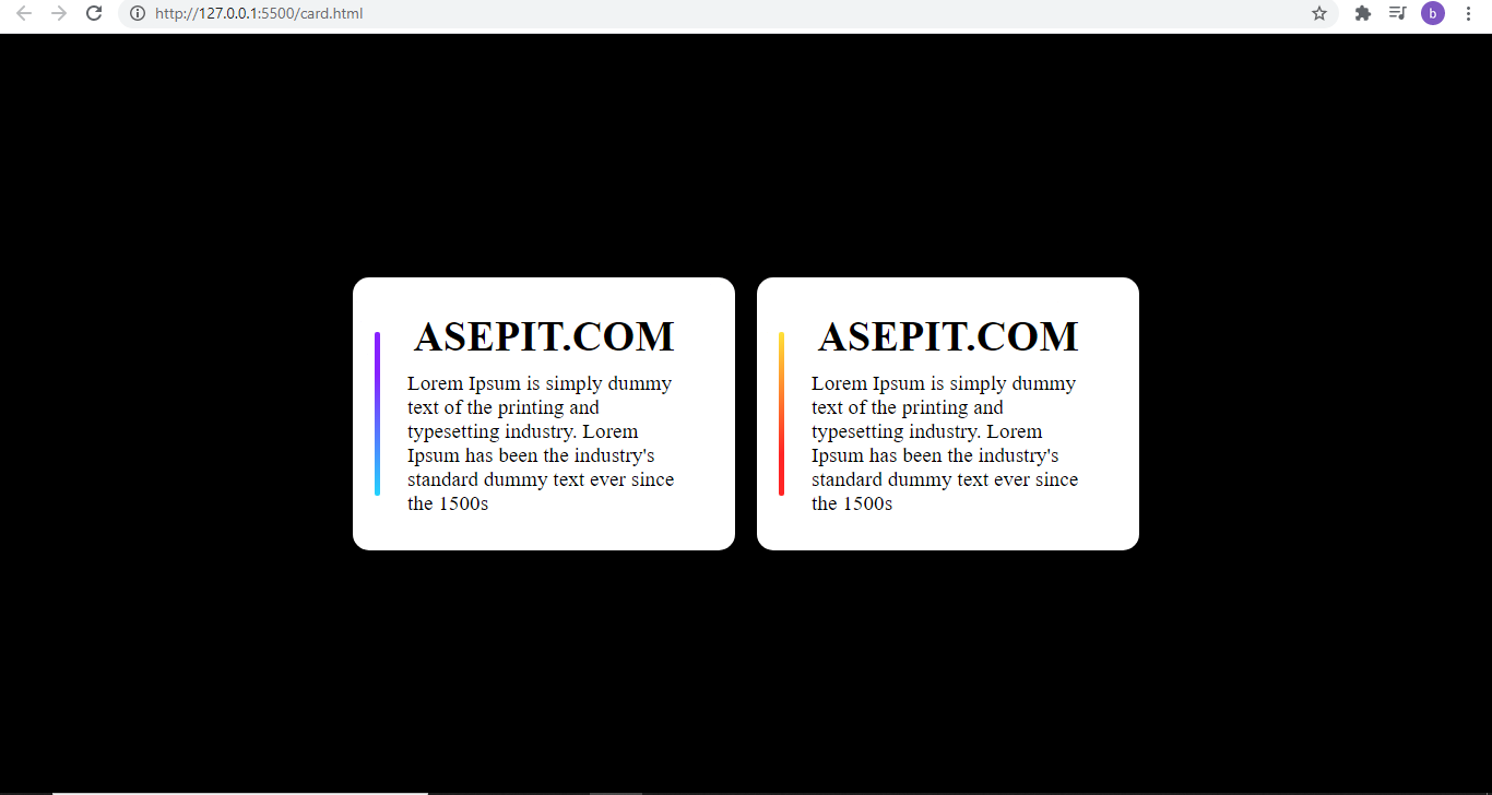
<div class="main center">
<div class="box center">
<h1>ASEPIT.COM</h1>
<p>Lorem Ipsum is simply dummy text of the printing and typesetting industry.
Lorem Ipsum has been the
industry's standard dummy text ever since the 1500s</p>
</div>
<div class="box center">
<h1>ASEPIT.COM</h1>
<p>Lorem Ipsum is simply dummy text of the printing and typesetting industry. Lorem Ipsum has been the
industry's standard dummy text ever since the 1500s</p>
</div>
</div>
Kedua kita harus membuat file css nya
* {
    margin: 0;
    padding: 0;
}

body {
    background: black;
}

.center {
    display: flex;
    justify-content: center;
    align-items: center;
}

.main {
    width: 100%;
    height: 100vh;
}

.box {
    width: 350px;
    height: 250px;
    margin: 10px;
    flex-direction: column;
    background: white;
    font-size: 1.2rem;
    border-radius: 15px;
    position: relative;
    transition: all .4s;
    overflow: hidden;
}

.box:hover {
    color: white;
}

.box::before {
    content: '';
    position: absolute;
    top: 50px;
    left: 20px;
    width: 5px;
    height: 150px;
    border-radius: 50px;
    transition: all .4s;
    background: linear-gradient(147deg, #ffe538 0%, #ff2525 74%);
}

.box:nth-child(1)::before {
    background: linear-gradient(19deg, #21d4fd 0%, #8721ff 74%);
}

.box:hover::before {
    top: 0;
    left: 0;
    border-radius: 0px;
    width: 100%;
    height: 100%;
}

.box p,
h1 {
    margin: 5px 50px;
    z-index: 1000;
}
DONE ... ^_^
Untuk demonya disini
Semoga bermanfaat sebagai pengetahuan untuk kita semua, terutama bagi penulis sendiri


Comments